http://www.aestheticamagazine.com/
I like this blog as all the colours complement each other and the pages are clearly set out. The names of the magazine articles are clear. I would take the layout to take to my own blog as it is clear.
http://www.art21.org/
I dislike this blog as the format isn't clear although this blog has some features which many other blogs don't offer. I would take the explore artists feature to my blog as I think it gives the opportunity to discover new inspirational artists.
http://www.artcritical.com/
I think this blog wouldn't draw in the attention of a younger audience as it's very information orientated and doesn't have a clear layout.
http://www.contemporaryartdaily.com/
I like the layout of this blog as the layout is easier to view; also as you are viewing one post at a time, it may draw the attention of the viewer to read that article. The blog also offers posts on the side; I would take this to my own blog.
http://observer.com/art/
I like this blog as the format is clear and it's informative without it being too much.
http://www.tate.org.uk/context-comment/blogs
I like this blog as it suggests galleries to go see, different artists work look into and what they're inspired by.
Wednesday, 16 December 2015
Wednesday, 9 December 2015
Art as a Message
 Daniela Matchael
 The colour in this painting conveys a powerful message. The colour of the environment around the boy, is dark and unclean this is portrayed by the dark browns and greys. However in the distance the buildings are bright colours such as oranges and yellows; by looking into the bright distance the painting gives the impression that the boy aspires to lives there and not live in a poverty stricken town. This also applies to the contrast of the painting, between wealth and poverty. The way that the buildings are painted may suggest that, to him, all the buildings blend together; although the buildings close to him are well structured.
Pawel Kuczynski
'Love'
 The colours in this painting set the mood/ message as it shows Venice at night which is known for being a historically beautiful place. This image represents the world not taking in what's around us and being taken by social media.
Wednesday, 2 December 2015
Transcribing Caro Evaluation
This is my evaluation for the 'Transcribing Caro' project.
I found the primary research that I collected on the trip to the YSP and the Hepworth Gallery extremely valuable as the photographs were the base of my project. I found observing the sculpture in life rather than in a picture a lot simpler since in life it is easier to see the structure, shape, and the realistic size of the sculpture.

I found the primary research that I collected on the trip to the YSP and the Hepworth Gallery extremely valuable as the photographs were the base of my project. I found observing the sculpture in life rather than in a picture a lot simpler since in life it is easier to see the structure, shape, and the realistic size of the sculpture.

I am happy with the primary research that I collected from the trip however I do regret not taking photos of the sculptures from various different angles as I think these would have made interesting pages in my sketchbook and I would have liked to develop them further. I did, however, do this with one particular sculpture. This was Caro's 'Childs Tower Room' sculpture, I produced a double spread studying this particular sculpture.
I think my research is very effective as the artists that I have researched have massively influenced my final sculpture. For example, my sculpture includes solid bright colours which is inspiration from Caro's pieces.
I have planned my sculpture by firstly designing three sculptures, then further developing my favourite one. I chose the final design as I think that it would be more interesting to produce and I could include many influences into it; whereas if I created a wall mounted sculpture of mobile sculpture, there isn't many influences that I could involve in that.
When making my maquette, I found the building stage beneficial to building my sculpture as I could tell which parts I may need to change or remove.
To date, I haven't had any problems in the production of my sculpture however in the ceramics workshop I decided to create the Perspex pieces, that would attach into the ceramic pole, after as this would be an easier way rather than making slits into the clay trying to achieve a perfect size.
I think I could have managed my time better throughout this project as at the deadline I had a few sketchbook pages to do. I took spent a lot of time on certain pieces rather than spacing my time out over all the project.
When constructing my final sculpture, a difficulty I had was that the ceramic post wouldn't be able to stand by itself on the stand. As a result of this I drilled a piece of wood to the base then glued the ceramic post to the base and wood with No Nails.
I found it fairly easy to assemble my sculpture as most of the pieces fit together easily.
I am satisfied with my final outcome as I would change a lot of it. I would change the overall layout and create a wall mounted sculpture as I think they would be more interesting to produce. I would also change the colours to more subtle ones.
Pinterest board- https://uk.pinterest.com/rachelbamforth/s-c-u-l-p-t-u-r-e-s/
Tuesday, 1 December 2015
Photography Workshop
 In the photography workshop, we focused on paper sculptures and made our own paper sculptures.
 These were my paper sculptures, there wasn't a plan when creating them although the idea for the bottom sculpture stemmed from the smaller versions we created in studio practice.
 When taking the pictures we regularly changed the positioning of the lamps giving a range of angles that the light hit the sculpture from, cause a variety of shadows.

Monday, 30 November 2015
Ceramics Workshop
In the ceramics workshop I produced the pole that the rounded Perspex pieces will be attached to, and the piece that was inspired by Barbara Hepworth. I used a metal pole as a starting point when making the stoneware pole. I had to make sure not to make the pole too thick as it wouldn't fire correctly in the kiln. I then cut two slots out of the pole to make an opening for the Perspex pieces.
I made the Barbara Hepworth inspired piece of my sculpture by cutting the standing plate from rolled out stoneware then attaching a base to the bottom using slip. I then cut an elongated oval fro the middle of the plate and small holes for the wire to pass through.
I made the Barbara Hepworth inspired piece of my sculpture by cutting the standing plate from rolled out stoneware then attaching a base to the bottom using slip. I then cut an elongated oval fro the middle of the plate and small holes for the wire to pass through.
3D Workshop
In the 3D workshop I produced the base and two connecting side panels of my sculpture. I made the base from MDF and carved a renaissance pattern, featured in my sketchbook, into the top. I then painted in the grooves of the carved side with yellow paint and sanded the top layer of paint off so the paint would only stick to the grooves creating a rustic effect.
I made the side panels of my sculpture also from MDF. I cut out the shape of my piece twice using the band saw. Since I thought the pieces looked quite bare, I cut various sized circles out of the wood and painted them yellow, matching with the base yellow.
I made the side panels of my sculpture also from MDF. I cut out the shape of my piece twice using the band saw. Since I thought the pieces looked quite bare, I cut various sized circles out of the wood and painted them yellow, matching with the base yellow.
Wednesday, 18 November 2015
3D Workshop Introduction
First in the workshop we were told the health and safety rules:
We were taught to use most machinery for later use so we could use them independently.
- goggle must be worn when using all machinery,
- hair and loose clothing must be tied back,
- bags shouldn't be brought into the workshop to avoid accidents,
- when the sign is shown, ear protection must be worn,
- lanyards must be removed to avoid accidents,
- wear strong shoes to avoid accidents.
We were taught to use most machinery for later use so we could use them independently.
Pillar Drill
The Pillar Drill is used to cut various sized holes into the wood using drill bits. Using the chuck we tightened the drill bits in place and used clamps to hold the wood into place.Band Saw
The Band Saw is used to cut various types of wood. The guide post is untighted to lower the rear blade guide, so your hands aren't exposed to the blade. The machine is then switched on and the wood is then placed under the saw. To assure accuracy, make sure to cut 2cms away from the line, then sand the wood down with the disk sander to get to the line.Fret Saw
The fret saw is used to cut into the more delicate parts of the wood. For example, the Fret Saw could be used to cut around sharp corners however it is easy to go off track and cut into different parts.Bobbin Sander
The Bobbin Sander is used to sand the areas of the wood that the belt/ disk sander can't reach. For example, hole inside the wood that don't have openings can be sanded with the bobbin sander.Monday, 9 November 2015
Studio Practice 03/11/15
In our studio practice, we were told to create a abstract sculpture using the materials provided such as pipe-cleaners, cardboard tubes, felt pieces etc. For our planning process, each member of our group each sketched an idea of what they wanted the sculpture to look like. We then pulled out different aspects of each members to contribute to the final sculpture; for example we took the shapes attached to the tubes from my sketch.

 When constructing our model, we used various bright colours and shapes to add the elements and principles and of design to it.
 |
| This was our final design. |

 When constructing our model, we used various bright colours and shapes to add the elements and principles and of design to it.
Thursday, 29 October 2015
Yorkshire Sculpture Park & Hepworth Gallery
On our trip to the Yorkshire Sculpture Park and Hepworth Gallery, we saw many of Caro's pieces. I think that the scale that he works on, suits each piece that he creates; for example, the 'Childs Tower Room' was a large piece to give the sense of adventure and excitement. However a lot of Caro's work is smaller therefore implies that he may favour working on a smaller scale. The material that Caro uses varies, however the majority of his pieces were constructed from metal and were bright coloured as well as a lot of pieces being seen as their natural appearance. Some of Caro's smaller pieces, were placed on higher platforms to grab more attention from their audience; the larger pieces however were on too big of a scale to place onto an additional platform. Seeing the work physically definitely changed how I see his work, since in pictures you don't see the scale of the artwork and the physical shape of the sculpture.
There were many differences between the two Caro exhibitions. Firstly, a lot of the work in the YSP exhibit was on a smaller scale therefore it was harder to analyse it's structure. Whereas in the Hepworth gallery, the majority of the pieces on show were on a larger scale therefore were easy to analyse.
There were many differences between the two Caro exhibitions. Firstly, a lot of the work in the YSP exhibit was on a smaller scale therefore it was harder to analyse it's structure. Whereas in the Hepworth gallery, the majority of the pieces on show were on a larger scale therefore were easy to analyse.
Tuesday, 27 October 2015
Caro Sculpture Analysation
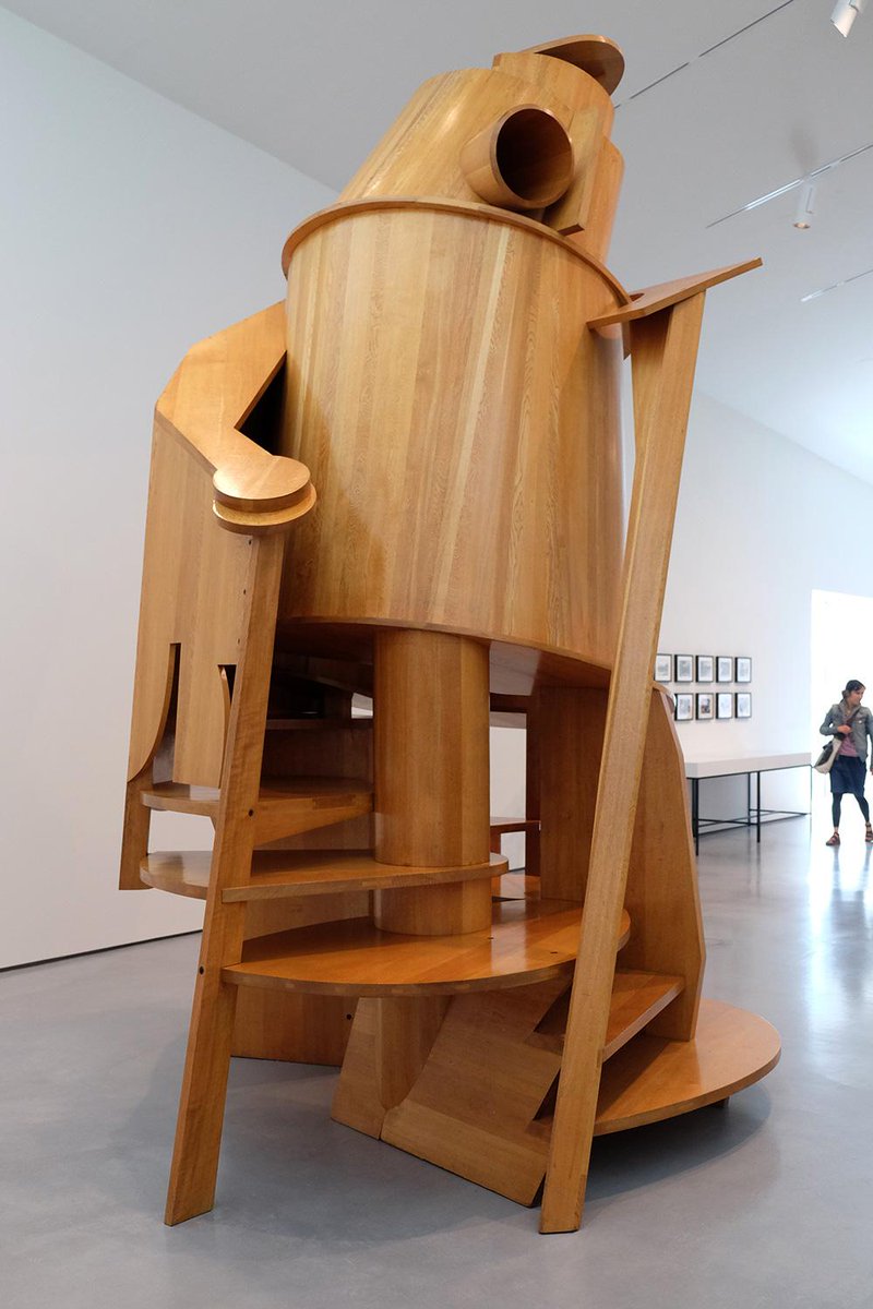
'Childs Tower Room'
How does it make you feel?
The sculpture makes me feel excitement as it relates to a happy time in my childhood.
Why do you think Caro chose this material?
I think he chose this material because it may be easier to construct with and helps with an abstract feel.
How do you think he started the piece? How has it developed?
Caro started this piece because he got given a brief to make a room to be shown in Liberty's department store on Regent Street so he made the Childs Tower Room.
Was the sculpture based on reality or imagination?
Caro's 'Child's Tower Room' was an imaginative idea 'I thought why not do a room that children can experience in a physical way'.
Does it remind you of anything?
The sculpture reminds me of a Helter-skelter; this is because of its rounded structure. Also because of the various stairs that lead inside.
How is it different to see art in a gallery compared to on the internet?
It is different because in a gallery, you can physically see the art and its scale. Rather than reading about it you can analyse it yourself.
Do you like the artwork? Why?
I do like this piece of artwork because of its form and size. I also like it because it is interactive and how such a simple structure could bring someone such happiness.
What do you think it means ?
I think the sculpture means to capture childhood since it is available for under 10s to climb on it.
What would you change about it?
If I could change this piece of art, I would change the colours. Although since the sculpture is made from Japanese Oak, that is obviously part of the sculpture's identity therefore it would take a lot away from the minimalistic feel of it.
If you could display the artwork anywhere else, where?
I would put the artwork in a children's school or play area as Caro designed the sculpture for children to explore and the experience in a more physical way other than to just at it in a gallery.
How had it been made?
I think the 'Child's Tower Room' was made by a mechanical process as it would be difficult to create those shapes by hand.
How long did it take to make?
The sculpture took one year to make; although I think that Anthony Caro wad thinking of the idea for the design for a while before.
What materials were used?
The materials used to make the sculpture was Japanese Oak.
What kind of marks/ texture can you see in the surface?
From a distance you can tell that there are some miner detail to the surface. However, close up it is evident that there are many details within the surface. Also the bolts fixing the wood together, are left seen to the audience; this suggests that Caro wanted to keep his design simple and his audience to see the process that the sculpture has been through.
Has Caro used a limited or varied colour palette?
Caro has used a limited colour palette since he has only used wood. This may be because he thought the sculpture didn't need colour as it was aimed towards a younger audience and may take away from the messages from the sculpture.
How would the mood of the artwork change if it contained different colours?
I think the mood of the artwork would change if it was bright coloured. If it was bright green for example, the colour would massively take away from the meaning of the sculpture as it isn't about the colour and the colour doesn't provide the message.
What can you see from different angles?
From all angles of the sculpture's base, you see many different entrances to the piece causing it seem more like a sculpture in a children's park than a sculpture in a gallery.
Why do you think Caro works on this scale?
I think Caro works on this scale to make it seem more like an exploration for a young child. Where as if the sculpture was half the size, it wouldn't seem like an exciting adventure for a child.
If the piece were placed outside, how would its appearance change?
I think it would benefit the piece by placed outside as it seems more adventurous than the sculpture being in an inside space. However, the weather conditions of the outside would damage the Japanese Oak of the sculpture.
Childs Tower Room -1983/1984
Japanese Oak, varnished
Barford Sculptures Ltd
Caro remembered his thoughts when making this sculpture, recalling.
'In 1983 four artists were each asked by the Arts Council to make a room to be shown in Liberty's department stone on Regent Store on Regent Street and I made the 'Childs Tower Room'. I thought why not do a room that children can experience in a physical way...in some ways the 'Child's Tower Room' is like a tree house; it has portholes, entrances small enough to squeeze through, steps you can squat under. it is a way of learning about the space you inhabit'.
Sunday, 18 October 2015
Hands On Evaluation
This is my evaluation for the 'Hands On' project.
I have experimented with media to explore the characteristics of a wide range of visual language by creating approximately 20 glossary pages for the elements and principles of design and workshop keywords. As an example when given the word colour, I thought of using warm and cold colours as an idea for the page. Therefore I painted symmetrical hands of which one features warm colours and the other cold colours.
When making my glossary, I found the experience challenging when thinking of ideas to fit into the criteria for that particular element, principle or keyword. For example I struggled thinking of an idea for texture, but then searched through my workshop outcomes and chose a piece to build on and develop. However in parts, rewarding since I gained a detailed and greater understanding of visual language; I think that this will also help me throughout the course and with other projects.
I do think that learning about terminology and producing a glossary page has improved my English skills as I now have a more in-depth understanding of the phrases used when using visual language.
Throughout the project, produced a range of research to support my ideas and thoughts. Firstly, I took my own primary photographs as a support for my observational drawing that I produced. As examples:


Secondly I also produced a Pinterest board(https://www.pinterest.com/rachelbamforth/h-a-n-d-s/), in which I captured many secondary sourced pictures that either inspired me to work in the style of the work and recreate it, or which I found that artist of which created it, and produced an artist study on them. I created 3 artist studies, all of which the artists have influenced me to create art similar to theirs. For example one of the studies I produced was on Iris Scott, she creates her painting with her only tool being her hands. This amazed me by how something so detailed, was produced only by hands. My research has been very useful in supporting my practical work since the majority of the pieces I produced were thought of from a picture. However I found the primary research that I created, more useful since I could control how the photographs were taken and how the audience would perceive them. If I were to improve any of my research skills or methods, I would have used a wider range of medias, to produce the secondary and primary photos since then I would have experimented with different media and known what not to use in the future and which worked best.
Throughout the workshops that I have taken part in, I have learnt various techniques. One that I can remember in detail is Batik. Batik is a process where using a Tjanting tool which holds the melted hot wax, you draw onto the paper in patterns as the wax goes through the spout on the tool. After when dry, this can be worked back into using watered down brusho paints to add colour and add additional designs. Then after the brusho has dried you can iron the paper in between many other sheets of newspaper(making sure not to ruin the iron with the wax) to melt the wax from the page to leave white marks from where the wax was earlier applied.


Another process that I learnt was monoprinting. This is achieved when using a brayer to roll out printing ink then scratching out the drawing into the ink with the end of a paint bush. You then place the piece of paper over the top of the ink and, with a clean brayer, roll over the top of the paper to press it into the ink to assure that the ink prints onto the paper. After making sure that the brayer has rolled over all the paper, then take the paper away from the ink.

 I think that the outcomes of my workshops could have turned out better as, in the majority of the workshops, it was my first time using the resources; I think that if I were to produce the outcomes again, then it may be more successful or the mistakes that were made the first time would not be made the second. For example, in the ceramics workshop I produced a hand. This process was challenging since I had never used the materials before. I faced many problems such as the fingers not being supported which resulted in them falling off.

 I think that the outcomes of my workshops could have turned out better as, in the majority of the workshops, it was my first time using the resources; I think that if I were to produce the outcomes again, then it may be more successful or the mistakes that were made the first time would not be made the second. For example, in the ceramics workshop I produced a hand. This process was challenging since I had never used the materials before. I faced many problems such as the fingers not being supported which resulted in them falling off.
I think that my overall portfolio is effective because I included various primary and secondary sources and also added further developments onto them. My portfolio also includes many glossary pages that are visual representations of the principles and elements of design. If I were to improve my portfolio, I would defiantly include all twenty glossary pages which I did not have the time to complete. I would also use a range of different media other than paint and pencil.
My definition of creativity is taking a concept, whether it be worded or just an imaginative idea, and transforming it into an artistic form. Throughout the project I have learnt that the inspiration for creativity can come from any form; from other artist's work to looking at our own hands. I think I have improved my creativity skills by working with visual language and transforming a word into a picture.
I have found working independently easier than it would be working collectively as a group since it would be hard to get my ideas for the project across as it is sometimes difficult to show ideas if they are not in an artistic form.
I could have definitely managed my time better with this project since by the end of it, I didn't have time to complete all the twenty glossary pages.
I think I have produced the work to my best ability; although I think that some of my work is at a better standard than the rest. This may be because I donated a lot of my time to that one piece when it should have been spread across evenly; this will be something I will work on during the next project.
Overall the whole project, I have mostly enjoyed the sketchbook work since I could research other artist's work and work in their styles. I have also enjoyed working through the workshops because this allowed me to try out different medias and to stem into other directions of art and design and not just focus on painting or drawing.
Tuesday, 13 October 2015
3D Designs Workshop
In the 3D workshop, we first were introduced to the healthy safety rules of the workshop.
These were:
We were then introduced to a 'Shape-scape', this is a bunch of shapes which slot together to create an abstract sculpture. After this we were given our own shapes to create our own shapes-scape with. When asked what I thought it resembled, I said a shark; since the front triangle looks like a sharks head and the back shape looks like a tail.


Then we were given a cutting mat, scalpel and some cardboard, we got to work on our individual shape-scapes. After thinking about what the simplest option would be, I decided on a flower. I then set about creating the shapes was going to use; I first cut out a basic circle as the middle of the flower. After cutting the first petal from the cardboard, I lined it up to the circle to see how many petals I would need to fit around the flower to make it look complete; to make the cutting process easier, I drew around the first petal 8 times(since that was the amount of petals needed) to make sure that they were identical.
 Since it was pointed out to me that when I would attempt to slot the petals into the circle, they would be pointing in the wrong direction. To solve this, I cut out little 4cm by 1cm rectangles to connect the petals in the right direction.
 We were then told to develop a sculpture using shaped, slotted cardboard shape-scapes to create an abstract sculpture to represent hands. As a starting point, I used the back of the hand since I thought it was a easier piece to then build onto. I cut long vertical slots out of the first piece for the knuckles to slot onto.


I then started to build on this by created more slots and adding more cardboard to create fingers. Although when it came to making the back more 3D like, it was difficult to fix another piece of cardboard onto it; therefore I bent a piece of cardboard around, to fit onto the whole back of the then cut slots into it so it would connect to the slots on the side. Although when it was completed, I did find that it resembled a turtle rather than a hand, this is something I would change if I were to do this again.
Keywords:
These were:
- Use cutting mats or boards not desk tops.
- For straight lines, use safety rulers.
- Keep the hand, which isn't holding the blade, behind the cutting blade at all times.
- Never cut towards your body.
- Don't press on too hard as this could damage equipment or cause you to lose control of the blade, causing accidents.
- Be aware that you are around others.
 |


Then we were given a cutting mat, scalpel and some cardboard, we got to work on our individual shape-scapes. After thinking about what the simplest option would be, I decided on a flower. I then set about creating the shapes was going to use; I first cut out a basic circle as the middle of the flower. After cutting the first petal from the cardboard, I lined it up to the circle to see how many petals I would need to fit around the flower to make it look complete; to make the cutting process easier, I drew around the first petal 8 times(since that was the amount of petals needed) to make sure that they were identical.
 Since it was pointed out to me that when I would attempt to slot the petals into the circle, they would be pointing in the wrong direction. To solve this, I cut out little 4cm by 1cm rectangles to connect the petals in the right direction.
 |
| I then started decorating the flower with a colourful design. |
 We were then told to develop a sculpture using shaped, slotted cardboard shape-scapes to create an abstract sculpture to represent hands. As a starting point, I used the back of the hand since I thought it was a easier piece to then build onto. I cut long vertical slots out of the first piece for the knuckles to slot onto.

I then started to build on this by created more slots and adding more cardboard to create fingers. Although when it came to making the back more 3D like, it was difficult to fix another piece of cardboard onto it; therefore I bent a piece of cardboard around, to fit onto the whole back of the then cut slots into it so it would connect to the slots on the side. Although when it was completed, I did find that it resembled a turtle rather than a hand, this is something I would change if I were to do this again.
Keywords:
- Shape-scape
- Cutting mat
- Abstract
- Slotted cardboard
- Scalpel
- Craft knife
- Slot puncher
Monday, 12 October 2015
Studio Practice 3
In studio practice 3 we made wire hand sculptures. This was quite challenging since it was difficult to achieve a hand like frame. I took the approach of making twists in the wire to make the wire frame to have a 3D look to it.


Ceramics Workshop
In the ceramics workshop, we first drew ideas of what we would want to later produce.

Firstly, we got a block of clay, rolling pin, two wooden sticks and a piece of hessian to put the clay on so it would be easier to turn when rolling out the clay. We put the clay in the middle of the hessian and the sticks either side. The sticks make sure you don't roll our the clay too thin so it cannot be worked with.
 When the clay was rolled out down to the sticks, we placed our hands onto the clay then drew around them to form the basic figure/ starting point. We cut the basic outlines of the hands with a sharp wooden tool.


After this we then started to create our pieces from stone clay. I chose to create the bottom left drawing since I liked the design of this more than the others.
 |
| This was the position I was aiming for with my piece.
|
Firstly, we got a block of clay, rolling pin, two wooden sticks and a piece of hessian to put the clay on so it would be easier to turn when rolling out the clay. We put the clay in the middle of the hessian and the sticks either side. The sticks make sure you don't roll our the clay too thin so it cannot be worked with.


From this point sculpting the hand into the position that I hoped to create, was a challenge since the base wasn't thick enough to hold up the whole sculpture. To solve this, I attached a thicker clay base to the wrist of the hand; this helped a lot for when I started positioning the fingers. When I was positioning some of the fingers, I had trouble when getting them to stay in that position; this resulted in me detaching the fingers from the hand to build them up so they were more likely to stay in the positions that I had put them in before. I reattached them by using slip which consists of clay and water, this then acts as a glue when the surface of where it is going to be placed is scored.
Another problem of the process was that it was very difficult to hollow out the centre of the sculpture since the walls of the hand were quite thin so when I attempted to hollow out the piece, holes formed on the side.

 |
| This is what the final result was! |
When we had finished on our individual sculptures, we had to work together to produce a piece. We used a stand to help shape our sculpture and built up the hands to form a bowl like structure.

Keyword:
- sculpture
- stoneware
- rolling
- kneading
- wedging
- slab building
- firing
- biswit
- glazing
- decorating
- slip
Glossary Pages
Elements:
Principle:
- line
- shape
- form
- colour
- value
- texture
- space
Principle:
- patterns
- contrast
- emphasis
- balance/ symmetrical
- proportion/scale
- harmony
- rhythm/movement
- Scalpel
- Henna
- Sculpture
Studio Practice 2
In the second studio practice, we tried mono printing which involves rolling out printing ink with a brayer(much like in the printmaking workshop) and then putting paper on it lightly making sure not to press on it. Then placing your picture on top of the paper you're printing onto and going over the features in the picture with a pencil.
Another way of doing this would be to draw into the freshly rolled printing ink with the end of a pencil or paintbrush then place the paper on top of the ink. Then with a clean brayer, rolling it over the top of the paper to press the ink into the paper to achieve a print.
Another way of doing this would be to draw into the freshly rolled printing ink with the end of a pencil or paintbrush then place the paper on top of the ink. Then with a clean brayer, rolling it over the top of the paper to press the ink into the paper to achieve a print.

Photography Workshop
In our photography workshop, we were first introduced to the basic functions of the camera. For example the ISO. A low ISO is best suited in the daytime and a high ISO is best in low light.
We then took our own images to portray our personality. For example I took ,mainly, above angles of my hand screwing foil into a ball to convey stress.
Then we worked on a tripod which was much easier to control since then all the focus wasn't on holding the camera still. This also gave many other photo opportunities such as shutter speed. This let us create images that give the effect of movement.
When we edited the pictures on Photoshop, I added a leaf effect on my picture creating a double exposure shot.
Keywords:
- low key
- high key
- depth of fielded
- double exposure
- multiple exposures
- long exposure
- aperture
- ISO
- shutter speed
Studio Practice 1
In our first studio practice, we were shown the elements of design: colour; line; tone; space; texture; value. We were told to create illustrations for each element including the elements definition. In that studio practice, I did the colour and line elements. The idea that I had for colour was to do two hands, one in warm colours and one in cold colours, to show the difference between the warm and cold undertones. I then drew various words around the hands that explain the word colour. My line piece was inspired by a picture on pinterest which involved drawing lines within the hand to show direction and to shape the hand. I did this in pencil to not avoid using bold lines within the piece.
Textiles workshop
In the textiles workshop, we were introduced to many different types of design within textiles.
The first technique was screen printing. Firstly, I chose a screen which we would want to transfer onto the material. The screen was made from a wooden frame and a mesh stretched over the frame, I then used a squeegee to spread the paint over the screen to dye the fabric placed underneath it.
 Then the fabric was placed on the drying rack to fully dry and the squeegee was cleaned. The screen was cleaned by using a power washer to spray off the excess paint, then it was placed in the heat cupboard to dry.

The second technique was Batik. This involves using hot wax as a resistant to protect the fabric underneath from the dye. We first tried this out on thick paper to test out different patterns before we added it onto our screen print pieces. To create batik we used a Tjanting tool to apply the wax to the paper.


This then made a paper pulp which, when stretched over a mesh frame and dried, forms a paper form when the water is squeezed out of the frame with a sponge.


 Keywords:
The first technique was screen printing. Firstly, I chose a screen which we would want to transfer onto the material. The screen was made from a wooden frame and a mesh stretched over the frame, I then used a squeegee to spread the paint over the screen to dye the fabric placed underneath it.


The second technique was Batik. This involves using hot wax as a resistant to protect the fabric underneath from the dye. We first tried this out on thick paper to test out different patterns before we added it onto our screen print pieces. To create batik we used a Tjanting tool to apply the wax to the paper.

When the wax dried we used Brusho paint with water to add to the paper to show the effect that the wax resists the paint from the fabric or material.

The third one we did was paper making. This was achieved by adding shredded paper and adding water to it.

This then made a paper pulp which, when stretched over a mesh frame and dried, forms a paper form when the water is squeezed out of the frame with a sponge.


The final technique we did was embroidery. We first used heat transfer to transfer a picture from the paper onto fabric so we could then embroid it.


- Batik
- screen printing
- heat transfer
- paper making
- puff binder
- embrodiery
Art Critisim
An 'Art Critic' is someone who responds to, interprets the meaning, makes critical judgement about a specific piece of art. Art criticism is a genre of writing obtained in its modern form in the 18th centaury.
Art Critique's vary. They could be: newspaper reporters; scholars for local professional journals; artists reviewing other artists. However if the individual reviewing the piece is friends with the artist, this may cause the review/ critique to be biased.
An art historian studies work made in cultures, usually in a more distant time and space. They also focus on more modern and contempery art and cultures close to their own since it is more understandable and easier to breakdown and study.
Journalistic critiques are written for the public and include the reviews of art exhibitions in local galleries which the public would generally be known for taking an interest in. However, scholary critiques are written for specialised art audiences; which appreciate the professional written reviews, specifically aimed at themselves.
As expected, the critiques of art originated with the creation of art itself, there is evidence of this in texts found in the works of art criticism.
http://www.telegraph.co.uk/
Printmaking Workshop
In the printmaking workshop, we were introduced to different styles of print making and materials such as wood, and tools such as a brayer and cutters.
We started by practicing designs in a zentagonal style. This was, in time, very difficult to create new patterns.

Of all the designs on the sheet, I liked the top far left one the most since it was unique and was one of the more straight lined designs which I liked better since they were easier to achieve when cutting the lino.
Next we created our final designs which we were then to cut into the lino piece. I used, mostly, a mixture of the previous designs including the one I preferred.
 Within this design I made the centre a sun since I thought it was well fitting with the piece and potential colours which could be used. I also changed some of the final design since it may have been harder or close to impossible when producing with the lino cutter.
 Some of the designs in the final cut were difficult to produce such as the circles in the top left hand corner. However in the printing process, these turned out well.

In the process of printing, some colours worked better than others. For example, The one above didn't work as well as expected.
Although others, the following, worked out well:

.

The print above shows a print made by cutting out a coloured, in this case yellow, shape to match a shape on the design. then gluing it to the paper before printing on to it.
Keywords:
We started by practicing designs in a zentagonal style. This was, in time, very difficult to create new patterns.

Of all the designs on the sheet, I liked the top far left one the most since it was unique and was one of the more straight lined designs which I liked better since they were easier to achieve when cutting the lino.
Next we created our final designs which we were then to cut into the lino piece. I used, mostly, a mixture of the previous designs including the one I preferred.


In the process of printing, some colours worked better than others. For example, The one above didn't work as well as expected.
Although others, the following, worked out well:

.
 |
| We also used different types of paper to print onto like brown paper, shown in the picture above. |

The print above shows a print made by cutting out a coloured, in this case yellow, shape to match a shape on the design. then gluing it to the paper before printing on to it.
Keywords:
- relief printing
- brayer
- line printing
- La Poupee
- Chine Colle
- Henna
- Zentangle
Thursday, 8 October 2015
Tuesday, 6 October 2015
domino evaluation
In the morning, in our group work, we used the technique of
dropping a domino off of the table to hit others on the chair to fall on the
floor to continue the sequence; this was reused in the afternoon although just
used as falling onto the floor to avoid complications occurring.
When working in teams we all started different parts of the
domino topple individually and eventually came together and worked as a team on
individual parts of the topple which held errors. When it came to different
roles in the team we also followed this.
As problems occurred in the
domino topple we fixed them as we went along; an example would be when we made
sharp turns in the domino topple which caused the dominos to not fall in the
pattern that we wanted them to. To solve this we stood the dominos further
apart. This then restricted the patterns we could make with the dominos
When the whole room was producing the large scale domino
piece, we had to connect the dominos all together to achieve a working large
scale topple. To do this we had to talk to the connecting groups and discuss
how we would link the dominos together.
One thing that went well in our domino topple was a fall
onto the chair which continued onto the floor this was tested many times.
Although many things went wrong such as the piece which was attached to the
ceiling via a piece of string then released by a domino falling onto it, to
release it to fall onto others. However, this didn’t work as it got stuck since
there wasn’t enough pressure onto it to release it from its position. One thing
which I would change would be to test the domino topple more often to ensure
that no complications occurred.
I think that in the amount of time we were given, we
could’ve created a domino topple which was bigger and more individual/unique.
Over the whole day I think I gained better teamwork skills
to put forward into different situations. Also I met new people which made me
more comfortable in the situation I was in.
My strengths in the domino topple were building certain obstacles,
such as bridges and steps, into our domino topple to make the designs more
intriguing.
To improve the piece I think we should have tested it more
to ensure that it wouldn’t stop as easily as it did.
It is important to be creative and play as a designer so you
can discover different types of art which you never knew you were interested in
or could achieve in.
To be creative means to stem into other genres of art and
discover more to widen your range of artistic techniques.
Subscribe to:
Comments (Atom)