On our trip to the Yorkshire Sculpture Park and Hepworth Gallery, we saw many of Caro's pieces. I think that the scale that he works on, suits each piece that he creates; for example, the 'Childs Tower Room' was a large piece to give the sense of adventure and excitement. However a lot of Caro's work is smaller therefore implies that he may favour working on a smaller scale. The material that Caro uses varies, however the majority of his pieces were constructed from metal and were bright coloured as well as a lot of pieces being seen as their natural appearance. Some of Caro's smaller pieces, were placed on higher platforms to grab more attention from their audience; the larger pieces however were on too big of a scale to place onto an additional platform. Seeing the work physically definitely changed how I see his work, since in pictures you don't see the scale of the artwork and the physical shape of the sculpture.
There were many differences between the two Caro exhibitions. Firstly, a lot of the work in the YSP exhibit was on a smaller scale therefore it was harder to analyse it's structure. Whereas in the Hepworth gallery, the majority of the pieces on show were on a larger scale therefore were easy to analyse.
Thursday, 29 October 2015

Tuesday, 27 October 2015
Caro Sculpture Analysation
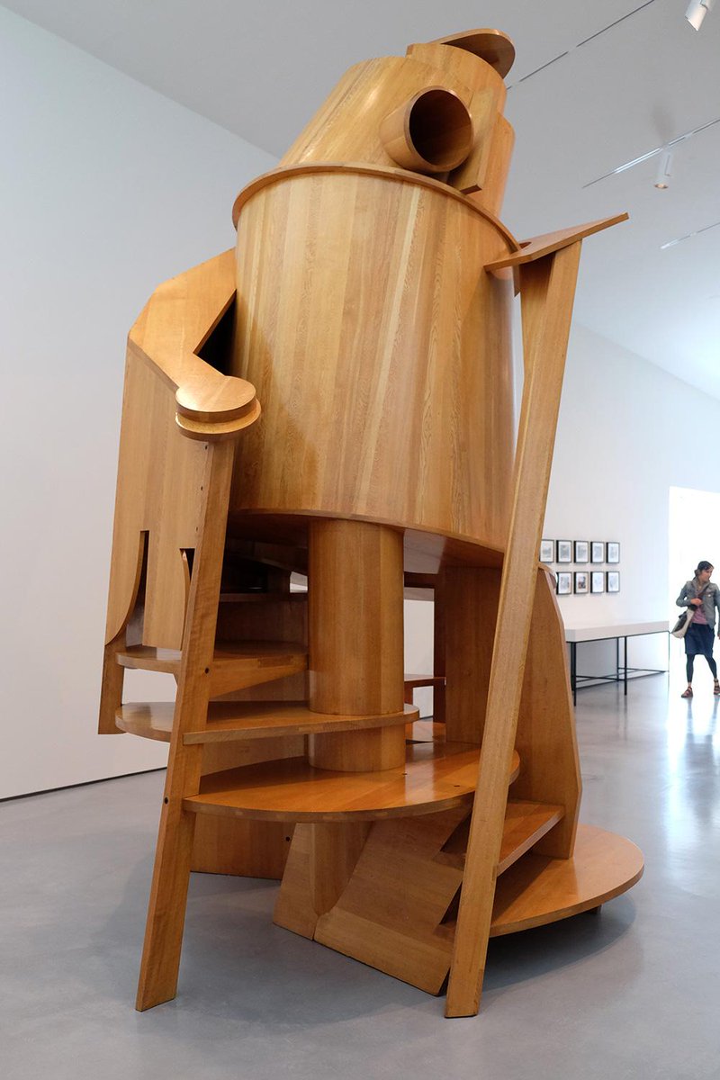
'Childs Tower Room'
How does it make you feel?
The sculpture makes me feel excitement as it relates to a happy time in my childhood.
Why do you think Caro chose this material?
I think he chose this material because it may be easier to construct with and helps with an abstract feel.
How do you think he started the piece? How has it developed?
Caro started this piece because he got given a brief to make a room to be shown in Liberty's department store on Regent Street so he made the Childs Tower Room.
Was the sculpture based on reality or imagination?
Caro's 'Child's Tower Room' was an imaginative idea 'I thought why not do a room that children can experience in a physical way'.
Does it remind you of anything?
The sculpture reminds me of a Helter-skelter; this is because of its rounded structure. Also because of the various stairs that lead inside.
How is it different to see art in a gallery compared to on the internet?
It is different because in a gallery, you can physically see the art and its scale. Rather than reading about it you can analyse it yourself.
Do you like the artwork? Why?
I do like this piece of artwork because of its form and size. I also like it because it is interactive and how such a simple structure could bring someone such happiness.
What do you think it means ?
I think the sculpture means to capture childhood since it is available for under 10s to climb on it.
What would you change about it?
If I could change this piece of art, I would change the colours. Although since the sculpture is made from Japanese Oak, that is obviously part of the sculpture's identity therefore it would take a lot away from the minimalistic feel of it.
If you could display the artwork anywhere else, where?
I would put the artwork in a children's school or play area as Caro designed the sculpture for children to explore and the experience in a more physical way other than to just at it in a gallery.
How had it been made?
I think the 'Child's Tower Room' was made by a mechanical process as it would be difficult to create those shapes by hand.
How long did it take to make?
The sculpture took one year to make; although I think that Anthony Caro wad thinking of the idea for the design for a while before.
What materials were used?
The materials used to make the sculpture was Japanese Oak.
What kind of marks/ texture can you see in the surface?
From a distance you can tell that there are some miner detail to the surface. However, close up it is evident that there are many details within the surface. Also the bolts fixing the wood together, are left seen to the audience; this suggests that Caro wanted to keep his design simple and his audience to see the process that the sculpture has been through.
Has Caro used a limited or varied colour palette?
Caro has used a limited colour palette since he has only used wood. This may be because he thought the sculpture didn't need colour as it was aimed towards a younger audience and may take away from the messages from the sculpture.
How would the mood of the artwork change if it contained different colours?
I think the mood of the artwork would change if it was bright coloured. If it was bright green for example, the colour would massively take away from the meaning of the sculpture as it isn't about the colour and the colour doesn't provide the message.
What can you see from different angles?
From all angles of the sculpture's base, you see many different entrances to the piece causing it seem more like a sculpture in a children's park than a sculpture in a gallery.
Why do you think Caro works on this scale?
I think Caro works on this scale to make it seem more like an exploration for a young child. Where as if the sculpture was half the size, it wouldn't seem like an exciting adventure for a child.
If the piece were placed outside, how would its appearance change?
I think it would benefit the piece by placed outside as it seems more adventurous than the sculpture being in an inside space. However, the weather conditions of the outside would damage the Japanese Oak of the sculpture.
Childs Tower Room -1983/1984
Japanese Oak, varnished
Barford Sculptures Ltd
Caro remembered his thoughts when making this sculpture, recalling.
'In 1983 four artists were each asked by the Arts Council to make a room to be shown in Liberty's department stone on Regent Store on Regent Street and I made the 'Childs Tower Room'. I thought why not do a room that children can experience in a physical way...in some ways the 'Child's Tower Room' is like a tree house; it has portholes, entrances small enough to squeeze through, steps you can squat under. it is a way of learning about the space you inhabit'.
Sunday, 18 October 2015
Hands On Evaluation
This is my evaluation for the 'Hands On' project.
I have experimented with media to explore the characteristics of a wide range of visual language by creating approximately 20 glossary pages for the elements and principles of design and workshop keywords. As an example when given the word colour, I thought of using warm and cold colours as an idea for the page. Therefore I painted symmetrical hands of which one features warm colours and the other cold colours.
When making my glossary, I found the experience challenging when thinking of ideas to fit into the criteria for that particular element, principle or keyword. For example I struggled thinking of an idea for texture, but then searched through my workshop outcomes and chose a piece to build on and develop. However in parts, rewarding since I gained a detailed and greater understanding of visual language; I think that this will also help me throughout the course and with other projects.
I do think that learning about terminology and producing a glossary page has improved my English skills as I now have a more in-depth understanding of the phrases used when using visual language.
Throughout the project, produced a range of research to support my ideas and thoughts. Firstly, I took my own primary photographs as a support for my observational drawing that I produced. As examples:


I have experimented with media to explore the characteristics of a wide range of visual language by creating approximately 20 glossary pages for the elements and principles of design and workshop keywords. As an example when given the word colour, I thought of using warm and cold colours as an idea for the page. Therefore I painted symmetrical hands of which one features warm colours and the other cold colours.
When making my glossary, I found the experience challenging when thinking of ideas to fit into the criteria for that particular element, principle or keyword. For example I struggled thinking of an idea for texture, but then searched through my workshop outcomes and chose a piece to build on and develop. However in parts, rewarding since I gained a detailed and greater understanding of visual language; I think that this will also help me throughout the course and with other projects.
I do think that learning about terminology and producing a glossary page has improved my English skills as I now have a more in-depth understanding of the phrases used when using visual language.
Throughout the project, produced a range of research to support my ideas and thoughts. Firstly, I took my own primary photographs as a support for my observational drawing that I produced. As examples:


Secondly I also produced a Pinterest board(https://www.pinterest.com/rachelbamforth/h-a-n-d-s/), in which I captured many secondary sourced pictures that either inspired me to work in the style of the work and recreate it, or which I found that artist of which created it, and produced an artist study on them. I created 3 artist studies, all of which the artists have influenced me to create art similar to theirs. For example one of the studies I produced was on Iris Scott, she creates her painting with her only tool being her hands. This amazed me by how something so detailed, was produced only by hands. My research has been very useful in supporting my practical work since the majority of the pieces I produced were thought of from a picture. However I found the primary research that I created, more useful since I could control how the photographs were taken and how the audience would perceive them. If I were to improve any of my research skills or methods, I would have used a wider range of medias, to produce the secondary and primary photos since then I would have experimented with different media and known what not to use in the future and which worked best.
Throughout the workshops that I have taken part in, I have learnt various techniques. One that I can remember in detail is Batik. Batik is a process where using a Tjanting tool which holds the melted hot wax, you draw onto the paper in patterns as the wax goes through the spout on the tool. After when dry, this can be worked back into using watered down brusho paints to add colour and add additional designs. Then after the brusho has dried you can iron the paper in between many other sheets of newspaper(making sure not to ruin the iron with the wax) to melt the wax from the page to leave white marks from where the wax was earlier applied.


Another process that I learnt was monoprinting. This is achieved when using a brayer to roll out printing ink then scratching out the drawing into the ink with the end of a paint bush. You then place the piece of paper over the top of the ink and, with a clean brayer, roll over the top of the paper to press it into the ink to assure that the ink prints onto the paper. After making sure that the brayer has rolled over all the paper, then take the paper away from the ink.

 I think that the outcomes of my workshops could have turned out better as, in the majority of the workshops, it was my first time using the resources; I think that if I were to produce the outcomes again, then it may be more successful or the mistakes that were made the first time would not be made the second. For example, in the ceramics workshop I produced a hand. This process was challenging since I had never used the materials before. I faced many problems such as the fingers not being supported which resulted in them falling off.

 I think that the outcomes of my workshops could have turned out better as, in the majority of the workshops, it was my first time using the resources; I think that if I were to produce the outcomes again, then it may be more successful or the mistakes that were made the first time would not be made the second. For example, in the ceramics workshop I produced a hand. This process was challenging since I had never used the materials before. I faced many problems such as the fingers not being supported which resulted in them falling off.
I think that my overall portfolio is effective because I included various primary and secondary sources and also added further developments onto them. My portfolio also includes many glossary pages that are visual representations of the principles and elements of design. If I were to improve my portfolio, I would defiantly include all twenty glossary pages which I did not have the time to complete. I would also use a range of different media other than paint and pencil.
My definition of creativity is taking a concept, whether it be worded or just an imaginative idea, and transforming it into an artistic form. Throughout the project I have learnt that the inspiration for creativity can come from any form; from other artist's work to looking at our own hands. I think I have improved my creativity skills by working with visual language and transforming a word into a picture.
I have found working independently easier than it would be working collectively as a group since it would be hard to get my ideas for the project across as it is sometimes difficult to show ideas if they are not in an artistic form.
I could have definitely managed my time better with this project since by the end of it, I didn't have time to complete all the twenty glossary pages.
I think I have produced the work to my best ability; although I think that some of my work is at a better standard than the rest. This may be because I donated a lot of my time to that one piece when it should have been spread across evenly; this will be something I will work on during the next project.
Overall the whole project, I have mostly enjoyed the sketchbook work since I could research other artist's work and work in their styles. I have also enjoyed working through the workshops because this allowed me to try out different medias and to stem into other directions of art and design and not just focus on painting or drawing.
Tuesday, 13 October 2015
3D Designs Workshop
In the 3D workshop, we first were introduced to the healthy safety rules of the workshop.
These were:
We were then introduced to a 'Shape-scape', this is a bunch of shapes which slot together to create an abstract sculpture. After this we were given our own shapes to create our own shapes-scape with. When asked what I thought it resembled, I said a shark; since the front triangle looks like a sharks head and the back shape looks like a tail.


Then we were given a cutting mat, scalpel and some cardboard, we got to work on our individual shape-scapes. After thinking about what the simplest option would be, I decided on a flower. I then set about creating the shapes was going to use; I first cut out a basic circle as the middle of the flower. After cutting the first petal from the cardboard, I lined it up to the circle to see how many petals I would need to fit around the flower to make it look complete; to make the cutting process easier, I drew around the first petal 8 times(since that was the amount of petals needed) to make sure that they were identical.
 Since it was pointed out to me that when I would attempt to slot the petals into the circle, they would be pointing in the wrong direction. To solve this, I cut out little 4cm by 1cm rectangles to connect the petals in the right direction.
 We were then told to develop a sculpture using shaped, slotted cardboard shape-scapes to create an abstract sculpture to represent hands. As a starting point, I used the back of the hand since I thought it was a easier piece to then build onto. I cut long vertical slots out of the first piece for the knuckles to slot onto.


I then started to build on this by created more slots and adding more cardboard to create fingers. Although when it came to making the back more 3D like, it was difficult to fix another piece of cardboard onto it; therefore I bent a piece of cardboard around, to fit onto the whole back of the then cut slots into it so it would connect to the slots on the side. Although when it was completed, I did find that it resembled a turtle rather than a hand, this is something I would change if I were to do this again.
Keywords:
These were:
- Use cutting mats or boards not desk tops.
- For straight lines, use safety rulers.
- Keep the hand, which isn't holding the blade, behind the cutting blade at all times.
- Never cut towards your body.
- Don't press on too hard as this could damage equipment or cause you to lose control of the blade, causing accidents.
- Be aware that you are around others.
 |


Then we were given a cutting mat, scalpel and some cardboard, we got to work on our individual shape-scapes. After thinking about what the simplest option would be, I decided on a flower. I then set about creating the shapes was going to use; I first cut out a basic circle as the middle of the flower. After cutting the first petal from the cardboard, I lined it up to the circle to see how many petals I would need to fit around the flower to make it look complete; to make the cutting process easier, I drew around the first petal 8 times(since that was the amount of petals needed) to make sure that they were identical.
 Since it was pointed out to me that when I would attempt to slot the petals into the circle, they would be pointing in the wrong direction. To solve this, I cut out little 4cm by 1cm rectangles to connect the petals in the right direction.
 |
| I then started decorating the flower with a colourful design. |
 We were then told to develop a sculpture using shaped, slotted cardboard shape-scapes to create an abstract sculpture to represent hands. As a starting point, I used the back of the hand since I thought it was a easier piece to then build onto. I cut long vertical slots out of the first piece for the knuckles to slot onto.

I then started to build on this by created more slots and adding more cardboard to create fingers. Although when it came to making the back more 3D like, it was difficult to fix another piece of cardboard onto it; therefore I bent a piece of cardboard around, to fit onto the whole back of the then cut slots into it so it would connect to the slots on the side. Although when it was completed, I did find that it resembled a turtle rather than a hand, this is something I would change if I were to do this again.
Keywords:
- Shape-scape
- Cutting mat
- Abstract
- Slotted cardboard
- Scalpel
- Craft knife
- Slot puncher
Monday, 12 October 2015
Studio Practice 3
In studio practice 3 we made wire hand sculptures. This was quite challenging since it was difficult to achieve a hand like frame. I took the approach of making twists in the wire to make the wire frame to have a 3D look to it.


Ceramics Workshop
In the ceramics workshop, we first drew ideas of what we would want to later produce.

Firstly, we got a block of clay, rolling pin, two wooden sticks and a piece of hessian to put the clay on so it would be easier to turn when rolling out the clay. We put the clay in the middle of the hessian and the sticks either side. The sticks make sure you don't roll our the clay too thin so it cannot be worked with.
 When the clay was rolled out down to the sticks, we placed our hands onto the clay then drew around them to form the basic figure/ starting point. We cut the basic outlines of the hands with a sharp wooden tool.


After this we then started to create our pieces from stone clay. I chose to create the bottom left drawing since I liked the design of this more than the others.
 |
| This was the position I was aiming for with my piece.
|
Firstly, we got a block of clay, rolling pin, two wooden sticks and a piece of hessian to put the clay on so it would be easier to turn when rolling out the clay. We put the clay in the middle of the hessian and the sticks either side. The sticks make sure you don't roll our the clay too thin so it cannot be worked with.


From this point sculpting the hand into the position that I hoped to create, was a challenge since the base wasn't thick enough to hold up the whole sculpture. To solve this, I attached a thicker clay base to the wrist of the hand; this helped a lot for when I started positioning the fingers. When I was positioning some of the fingers, I had trouble when getting them to stay in that position; this resulted in me detaching the fingers from the hand to build them up so they were more likely to stay in the positions that I had put them in before. I reattached them by using slip which consists of clay and water, this then acts as a glue when the surface of where it is going to be placed is scored.
Another problem of the process was that it was very difficult to hollow out the centre of the sculpture since the walls of the hand were quite thin so when I attempted to hollow out the piece, holes formed on the side.

 |
| This is what the final result was! |
When we had finished on our individual sculptures, we had to work together to produce a piece. We used a stand to help shape our sculpture and built up the hands to form a bowl like structure.

Keyword:
- sculpture
- stoneware
- rolling
- kneading
- wedging
- slab building
- firing
- biswit
- glazing
- decorating
- slip
Glossary Pages
Elements:
Principle:
- line
- shape
- form
- colour
- value
- texture
- space
Principle:
- patterns
- contrast
- emphasis
- balance/ symmetrical
- proportion/scale
- harmony
- rhythm/movement
- Scalpel
- Henna
- Sculpture
Subscribe to:
Posts (Atom)